Context
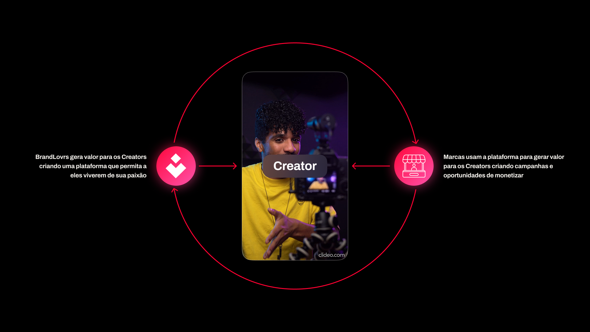
Creator Ads connected brands with creators through campaigns and rewards. The MVP already offered monetization opportunities, but the experience made it hard to understand how to participate and how much creators could earn.
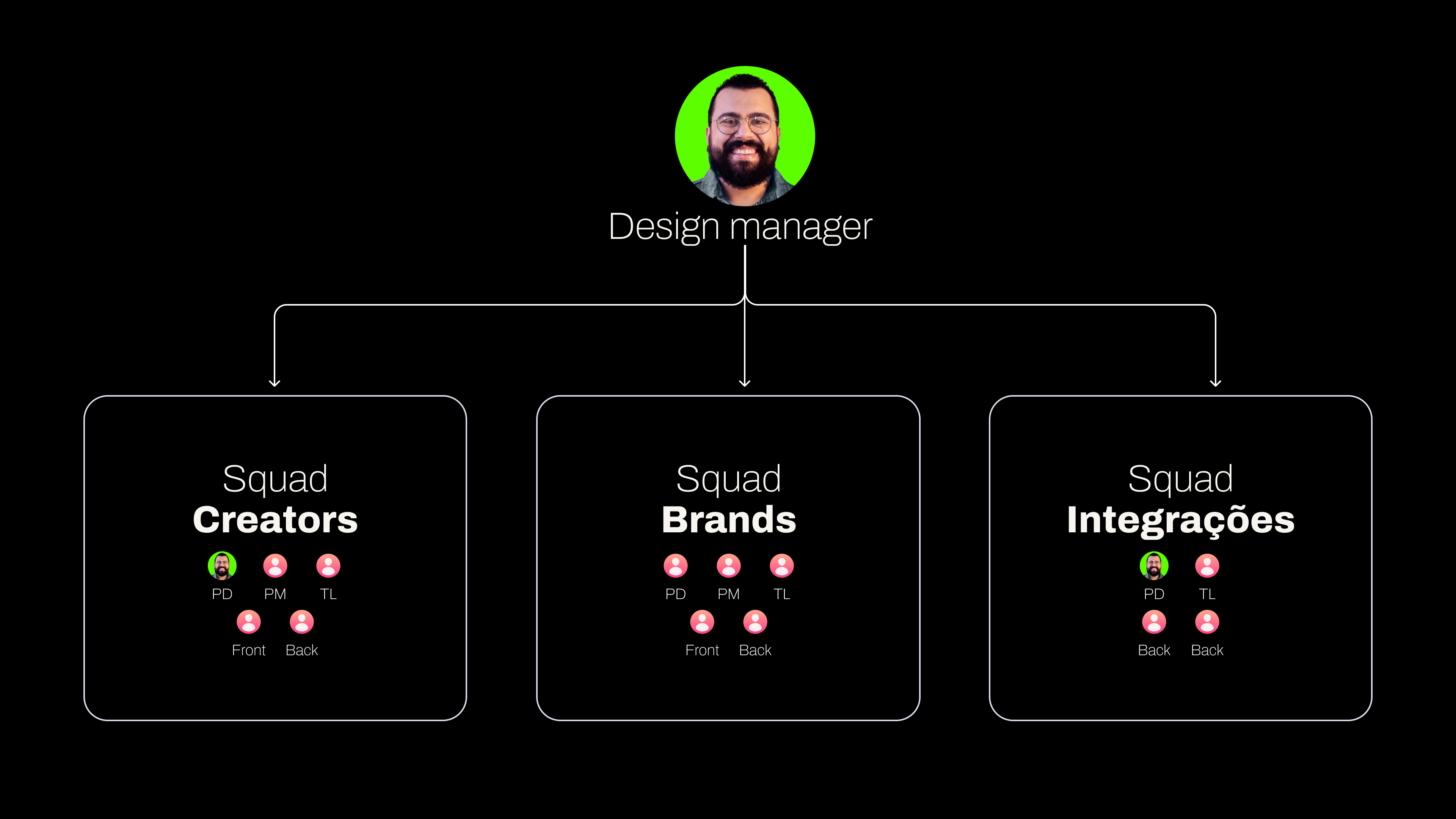
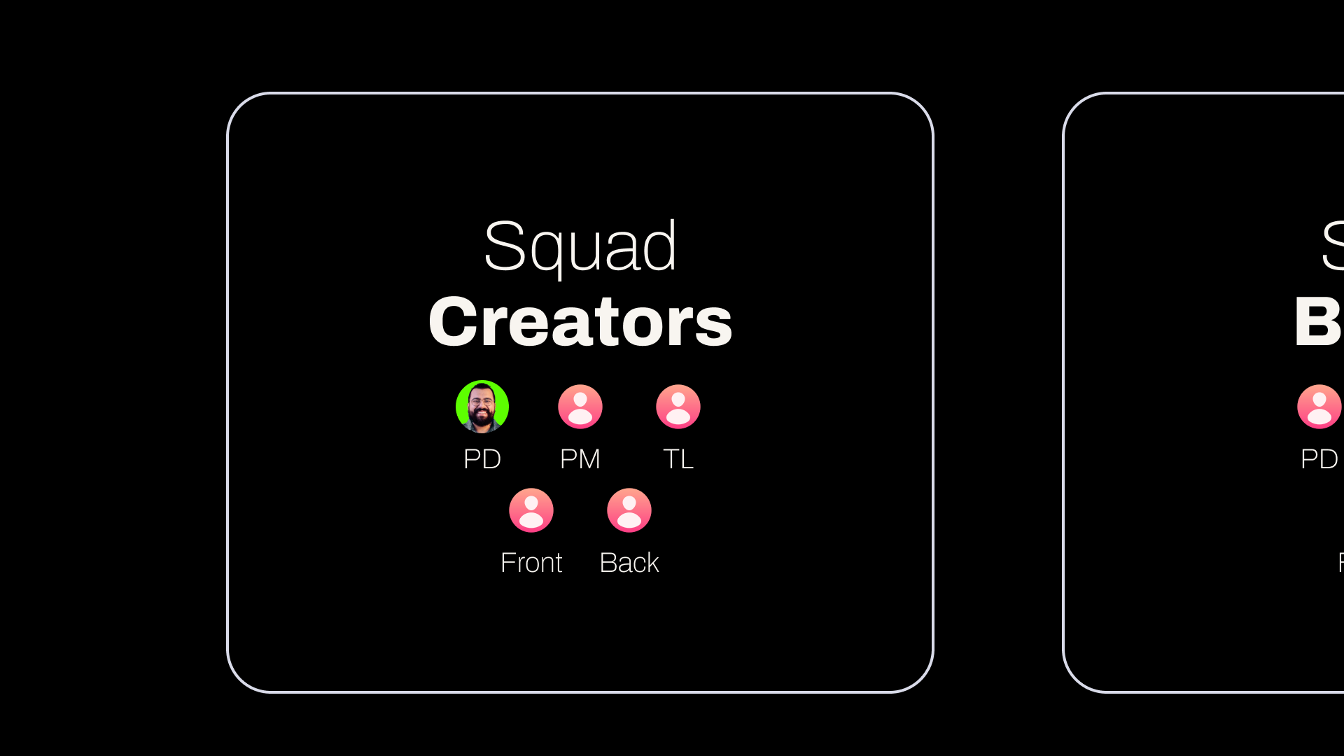
As Design Manager, my challenge was to set a direction for the creator experience: make the value proposition clear and simplify the path from discovering a campaign to participating and getting paid. I worked with the Creators squad, aligning design decisions with product and development priorities.
Hypothesis
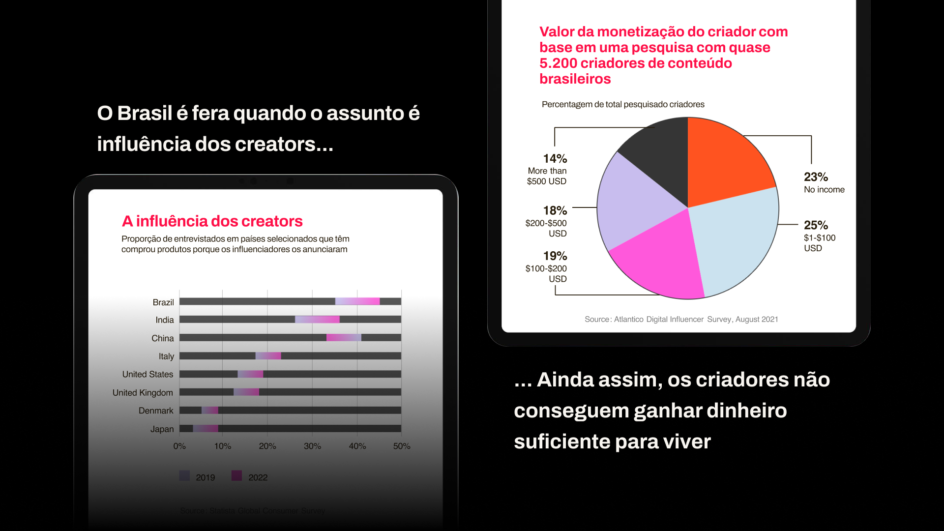
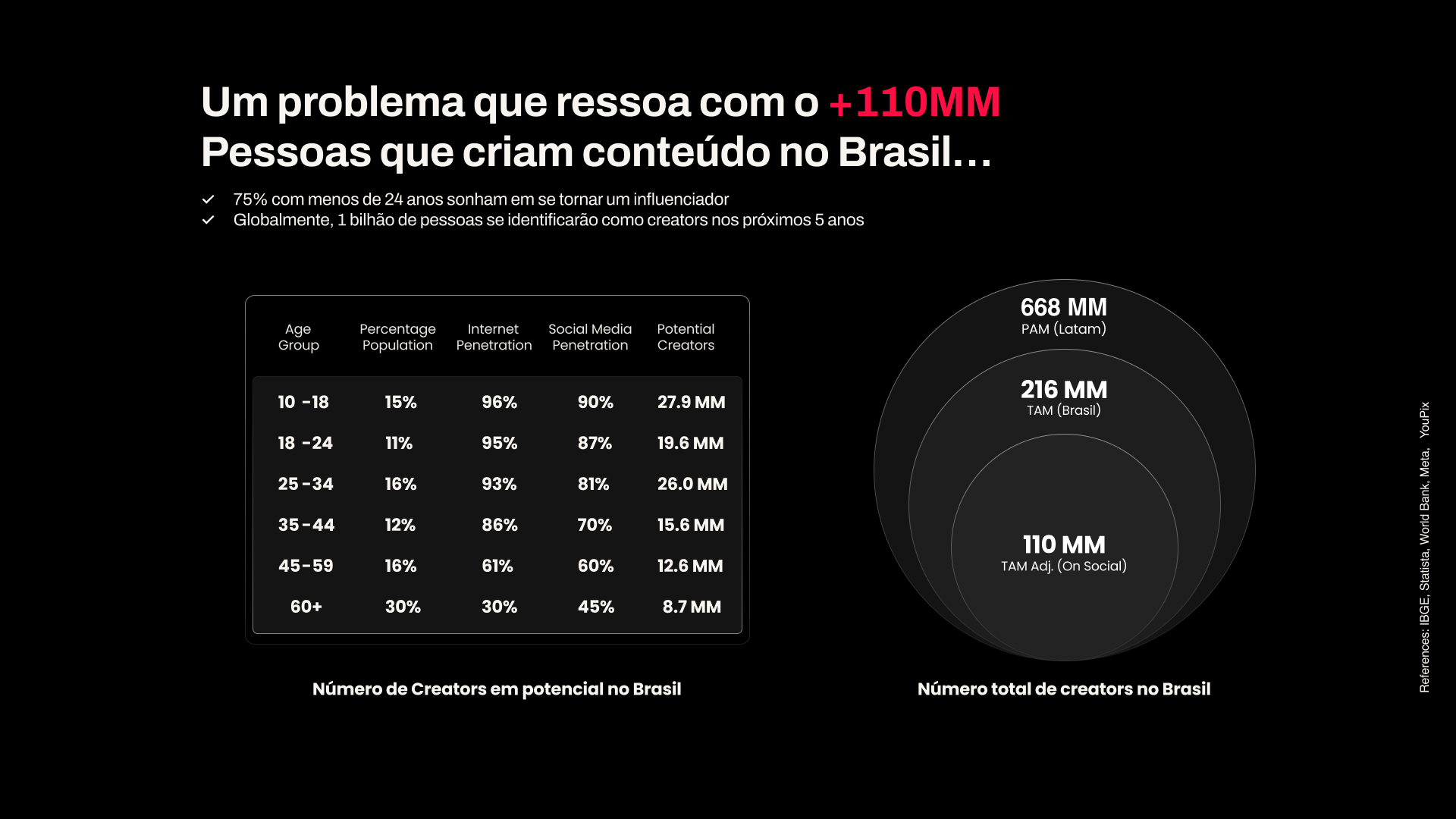
My hypothesis was that making rewards more visible and simplifying the journey would help creators find relevant opportunities and participate in campaigns. Before redesigning the screens, I needed to understand where the experience became unclear.
How I investigated
I combined interviews and usability testing with 10 creators: 5 active users, 2 former users, and 3 potential new users. I cross-referenced those findings with navigation behavior observed in Smartlook, support complaints, and examples from other platforms.
What we found
Four problems guided our decisions:
1. Unclear value proposition: even active users struggled to understand how earnings worked.
2. Long, complex flows: participating took effort, and the interface presented a lot of information with little focus.
3. Insufficient campaign information: creators lacked the clarity they needed to decide whether an opportunity was worthwhile.
4. Performance issues: instability also hurt the experience and needed to be addressed with the technical team.
What benchmarking taught us
I looked for references to address three specific needs: explain earning potential, guide the first steps, and organize campaign discovery. In the study, Airbnb provided examples of earnings estimates and guided experiences; TikTok, marketplace organization; and SocialSoul, clarity in the value proposition and onboarding.
These references helped shape approaches to test in our context.
Decision
I turned the findings into a set of priorities with the team: visible earnings and campaign discovery were essential; wallet improvements and notifications were part of the experience's evolution. More complex features, such as advanced analytics and a community space, were left out of the initial scope.
We decided to evolve the app in stages, using reusable components and monitoring actual behavior after each release.
Experience priorities
Visible earnings
Campaigns that are easier to find
Clearer participation
Wallet and continuity
Future vision
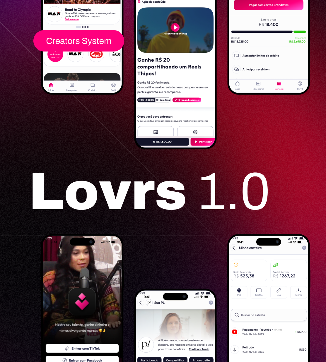
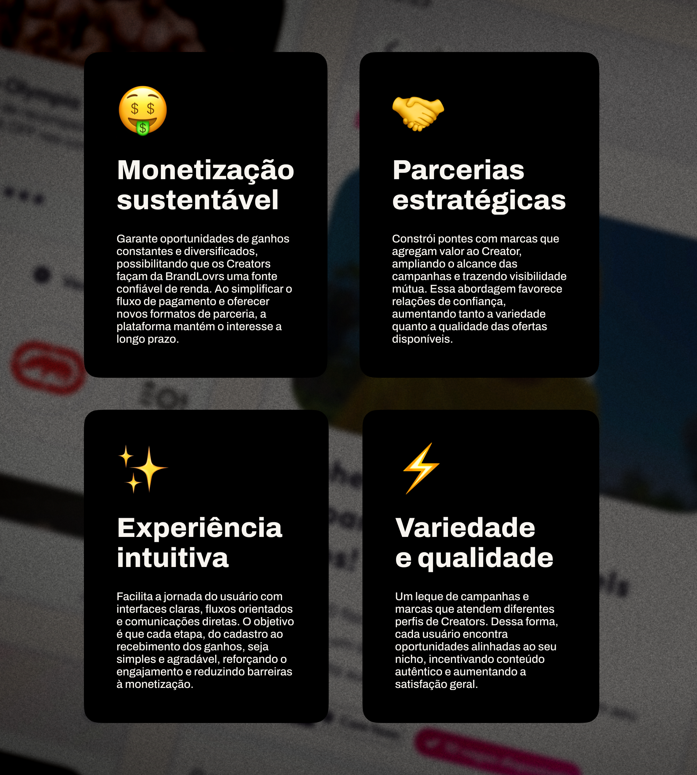
The pieces below present the visual direction and the pillars defined for the experience. They represent the vision for the product's evolution, which was broken down into incremental releases; they do not represent a complete launch of all features.
Shift in focus
Before
Chosen direction
Impact
Improvements were implemented incrementally and tracked through usage data and observations of user navigation in Smartlook.
The project presentation documents changes in the metrics below compared with the previous six months. They reflect the combined work of product, design, and development; they do not isolate the effect of any specific change.
Recorded results
in the number of creators with earnings
in reported app conversion
in monthly activation
A foundation for continued improvement
Beyond the journey improvements, I organized the app’s visual foundation with components, tokens, and documentation in Figma. This structure supported consistency across screens and collaboration with development as the product evolved.
The future vision extended this direction to campaigns, search, and the financial experience. It guided the next steps as releases were prioritized and validated in stages.
The accounts below are examples included in the original material to illustrate the platform’s value proposition; their figures are not part of the metrics for this release.

Lessons learned